 For my second day, my goal was to get a basic understanding of how the healthcare system works and continue learning the tools I installed yesterday. However, after communicating with my sponsor, we determined it would be most beneficial for me to search for datasets online and explore them using the tools on my computer instead of spending more time learning the basics. I still planned to research the principles of medical insurance. I didn't expect to have insightful analysis of the data I downloaded, but I did want to view it and make some connections.
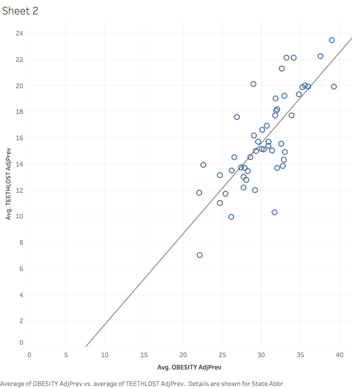
In order to learn more about health insurance, I first began learning about CMS (Centers for Medicare and Medicaid Services). Medicaid, Medicare, CHIP, and the Health Insurance Marketplace are all services provided by CMS. The organization oversees and hopes to foster innovation in the medical field. I also learned about risk adjustment, which is a system introduced by the Affordable Care Act that involves insurers who have healthier than average beneficiaries paying funds in order for insurers with less healthy than average beneficiaries to receive funds. This is a consequence of the law that an insurer has to provide insurance to anyone provided they can pay the premium. It exists to protect insurers who provide insurance to people who are less healthy than average. I learned that under a risk adjustment system, insurance providers must be careful to code the conditions of patients carefully and correctly to receive the proper payout from risk adjustment and maintain revenue. I spent the other part of my day searching for datasets relating to health and health insurance. At the suggestion of my sponsor, I visited the website Kaggle, which is the host of many publicly available datasets, and searched until I found interesting results. I downloaded several sets of data, which include: CDC metrics on 500 American cities, immunization rates of children in California, a breakdown of health insurance by state and how coverage changed with the ACA, and a statistics covering the most popular health searches online. I imported the data about medical searches into Tableau to see if I could learn anything, but I had trouble finding anything worthwhile. After that, I used the 500 American cities data, and found that Ohio had the most lost teeth out of any state. Intrigued by this, I plotted the teeth lost against the obesity rate of each state, and found a fairly strong correlation: the greater the population of obese people, the more teeth are lost. This relationship is shown in the graph below. Overall, I was pleased with the research I did and happy that I was able to make a chart using the data, but I was also frustrated that I didn't accomplish more using the data. I hope tomorrow I am able to make more insightful observations using the data and also be able to use multiple sources of data in some way. I will be meeting with my sponsor for lunch and that will help me get prepared for my first day at Paramount, Tuesday.
0 Comments
Leave a Reply. |
ArchivesCategories |
 RSS Feed
