 For my second day, my goal was to get a basic understanding of how the healthcare system works and continue learning the tools I installed yesterday. However, after communicating with my sponsor, we determined it would be most beneficial for me to search for datasets online and explore them using the tools on my computer instead of spending more time learning the basics. I still planned to research the principles of medical insurance. I didn't expect to have insightful analysis of the data I downloaded, but I did want to view it and make some connections.
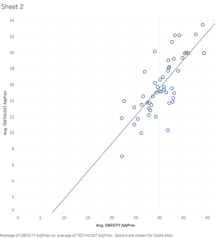
In order to learn more about health insurance, I first began learning about CMS (Centers for Medicare and Medicaid Services). Medicaid, Medicare, CHIP, and the Health Insurance Marketplace are all services provided by CMS. The organization oversees and hopes to foster innovation in the medical field. I also learned about risk adjustment, which is a system introduced by the Affordable Care Act that involves insurers who have healthier than average beneficiaries paying funds in order for insurers with less healthy than average beneficiaries to receive funds. This is a consequence of the law that an insurer has to provide insurance to anyone provided they can pay the premium. It exists to protect insurers who provide insurance to people who are less healthy than average. I learned that under a risk adjustment system, insurance providers must be careful to code the conditions of patients carefully and correctly to receive the proper payout from risk adjustment and maintain revenue. I spent the other part of my day searching for datasets relating to health and health insurance. At the suggestion of my sponsor, I visited the website Kaggle, which is the host of many publicly available datasets, and searched until I found interesting results. I downloaded several sets of data, which include: CDC metrics on 500 American cities, immunization rates of children in California, a breakdown of health insurance by state and how coverage changed with the ACA, and a statistics covering the most popular health searches online. I imported the data about medical searches into Tableau to see if I could learn anything, but I had trouble finding anything worthwhile. After that, I used the 500 American cities data, and found that Ohio had the most lost teeth out of any state. Intrigued by this, I plotted the teeth lost against the obesity rate of each state, and found a fairly strong correlation: the greater the population of obese people, the more teeth are lost. This relationship is shown in the graph below. Overall, I was pleased with the research I did and happy that I was able to make a chart using the data, but I was also frustrated that I didn't accomplish more using the data. I hope tomorrow I am able to make more insightful observations using the data and also be able to use multiple sources of data in some way. I will be meeting with my sponsor for lunch and that will help me get prepared for my first day at Paramount, Tuesday.
0 Comments
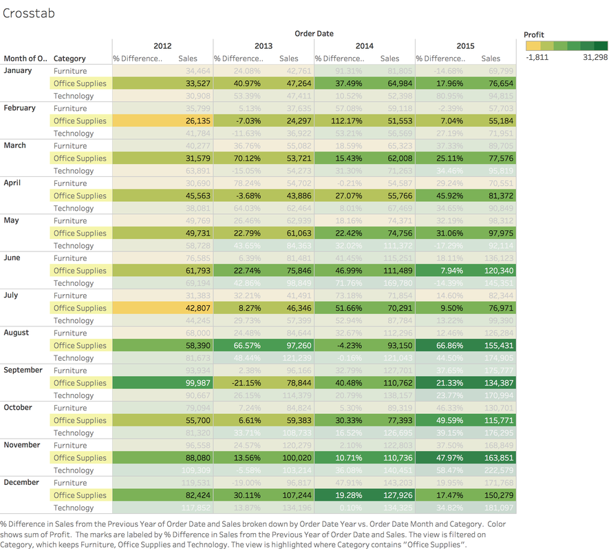 For the first day of my independent study, I planned to install all of the tools necessary for the next three weeks and familiarize myself with them. The software I needed includes: R, Rstudio, Tableau, and SAS. My goal was to become familiar with these to the extent that I had enough foundational knowledge to learn more advanced concepts without struggling. These tools will provide me with a basic understanding of manipulating and presenting data visually in order to analyze them on a deeper level. After installing all the required software, the first tool I used was R. R is a programming language designed for statistical analysis that has the ability to manipulate data and generate graphs, among many other capabilities. I used the resource Try R to learn the basics because it was a simple and brief introduction, yet it covered many concepts. What I learned includes basic syntax, data structures such as vectors and matrices, loading data from files, and generating simple graphs. The other software package that I took time to use was Tableau, which is an application for presenting data in a visually appealing style that aids analysis. I followed the beginning tutorial (which deals with sales data of a fictional retailer) on the Tableau website to get a feel for the software. I learned that you can import multiple datasets and combine them based on a common category (such as transaction id) and then analyze the combined data and metrics. While following the tutorial, I created several "worksheets" (graphics) displaying the data in meaningful ways, one of which is displayed at the top of the page. Overall, I thought installing these tools was a fairly simple task, but still vital to the rest of my independent study. It was rewarding for me to learn the basics of R and Tableau and get polished results in a short period of time such as the table I displayed above. However, I hoped to get to using Rstudio and SAS, but I didn't have enough time, so I want to spend some time looking at the basics of those utilities tomorrow. I found it challenging to stay focused a few times, but I think overall I did a good job diving into the tools I will be using. Tomorrow, I plan to familiarize myself with Rstudio and SAS, and work with R even more if time permits. I also want to build an in-depth understanding of the principles of modern healthcare before my first day at Paramount (Tuesday). |
ArchivesCategories |
 RSS Feed
